Top 10 Trends in Magazine Design for 2024

The world of magazine design is evolving at a rapid pace. With new technologies, innovative ideas, and fresh perspectives, the design trends for magazines are constantly changing. In this article, we will explore the top 10 trends in magazine design that are set to revolutionize the industry in this year.
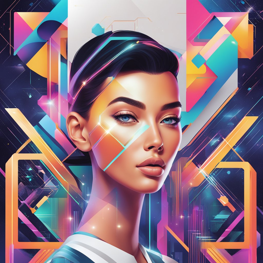
One of the major trends in magazine design for 2024 is the integration of AI and hand-drawn elements to create unique and engaging imagery. This combination of technology and creativity is transforming the way magazines are designed, and is set to become a key feature of the magazine industry in the coming years.
Another trend that is set to define magazine design in 2024 is the use of color and texture to create a visually rich and immersive experience for readers. From bold, vibrant hues to subtle, muted tones, magazine designers are experimenting with a range of color palettes to create a unique and engaging visual experience.
Key Takeaways
- Magazine design trends in 2024 will revolutionize the industry with the integration of AI and hand-drawn elements to create unique and engaging imagery.
- The use of color and texture will define the visual experience, with designers experimenting with a range of color palettes to create a unique and immersive experience for readers.
- Typography and layout will play a key role in crafting the user experience, with designers taking a fresh approach to create visually appealing and easy-to-read magazines.
Revolutionizing Imagery with AI and Hand-Drawn Elements
At the forefront of magazine design in 2024 is the integration of artificial intelligence (AI) and hand-drawn elements to create visually stunning and unique imagery. By combining the precision and speed of AI with the creativity and authenticity of hand-drawn graphics, designers are able to produce captivating visuals that engage and inspire readers.
The Rise of Artificial Intelligence in Design
AI has revolutionized the way designers approach the creative process. With AI-powered design tools such as Adobe Sensei, designers can now automate repetitive tasks and generate complex visuals with ease. This allows designers to focus on the more creative aspects of the design process, such as ideation and conceptualization.
One of the most exciting applications of AI in design is the ability to generate custom illustrations. AI-powered tools such as Wizeline and Sketch2Code can create illustrations based on user input, making it easier for designers to create unique and personalized visuals that align with the magazine’s brand.
Embracing the Human Touch with Hand-Drawn Graphics
While AI has certainly made its mark in the design world, there is still a place for hand-drawn graphics. In fact, the integration of hand-drawn elements with AI-generated designs has become a popular trend in magazine design.
Hand-drawn graphics add a human touch to the design, making it feel more authentic and relatable. This is particularly important in the age of social media, where readers crave content that feels genuine and personal.
Designers can use hand-drawn elements to create custom illustrations, typography, and even entire layouts. This approach allows designers to create visuals that are both unique and memorable, helping the magazine stand out in a crowded market.
Color and Texture: Defining the Visual Experience
As we move into 2024, magazine design is becoming more daring and experimental. Color and texture are at the forefront of this trend, and designers are pushing the boundaries of what is possible with these elements.
Vibrant Colors and Maximalism
One of the most significant trends in magazine design for 2024 is the use of vibrant colors and maximalism. Designers are moving away from the minimalist approach of recent years and embracing bold and bright colors to create a more energetic and dynamic visual experience.
From neon pinks to electric blues, the color palette is becoming more diverse and exciting.
Maximalism is also making a comeback, with designers layering bold colors, patterns, and textures to create a visually rich and complex design. This trend is all about creating a sensory overload that captures the reader’s attention and draws them into the content.
For example, a magazine cover might feature a mix of metallic accents, bold typography, and intricate patterns to create a visually stunning design that demands attention.
Incorporating Texture for Tactile Design
In addition to vibrant colors and maximalism, incorporating texture into magazine design is becoming increasingly popular in 2024.
Texture adds depth and dimension to a design, creating a tactile experience that engages the reader’s senses.
From embossed lettering to textured backgrounds, designers are using texture to create a more immersive experience for readers.
Visual texture is also becoming more prevalent, with designers using digital techniques to create the illusion of texture without adding physical elements to the design.
This approach allows designers to experiment with texture in new and exciting ways, creating designs that are both visually stunning and engaging.
Typography and Layout: Crafting the User Experience
When it comes to magazine design, typography and layout play a crucial role in crafting an engaging user experience. In 2024, we can expect to see a continuation of some of the typography and layout trends that have been gaining popularity in recent years, as well as some exciting new developments.
Bold Typography and Its Impact
Bold typography has been a growing trend in magazine design, and we expect to see more of it in 2024.
Bold typography is a powerful tool for creating visual impact and drawing readers’ attention to key elements of a layout.
This trend is particularly effective when used in conjunction with other design elements such as color, imagery, and negative space.
One exciting development in bold typography is the rise of dot fonts.
Dot fonts are a type of display font that uses dots instead of lines to form letters. This unique style of typography is a great way to add visual interest to a layout while still maintaining legibility.
Dot fonts are particularly effective when used in large headlines or as part of a typographic hierarchy.
Strategic Use of Space and Grids
Another important aspect of magazine design is the strategic use of space and grids. In 2024, we expect to see designers rediscovering the power of pixels and using them to create dynamic, engaging layouts.
One way designers are using pixels is by breaking away from traditional grid systems and creating more fluid layouts. This approach allows for more creative freedom and can help create a more immersive user experience. However, it’s important to use this technique carefully to avoid overwhelming the reader.
Another trend we expect to see in 2024 is the use of negative space as a design element.
Negative space, also known as white space, is the area around and between design elements.
When used effectively, negative space can help create a sense of balance and harmony in a layout. It can also help draw the reader’s eye to key elements of the design.
Innovative Approaches to Engagement and Accessibility
At the forefront of magazine design trends for 2024 is the need for innovative approaches to engagement and accessibility. With readers seeking more interactive and engaging content, multimedia and animation are becoming increasingly popular. At the same time, designers are recognizing the importance of creating accessible content that can be enjoyed by all readers.
Enhancing Engagement Through Multimedia and Animation
Incorporating multimedia and animation into magazine design is an effective way to enhance engagement and create a more interactive reading experience.
From videos and GIFs to interactive infographics and animations, multimedia elements can help to bring stories to life and keep readers engaged.
Designers are also experimenting with augmented reality (AR) and virtual reality (VR) to create immersive experiences that blur the lines between print and digital media.
By integrating AR and VR into magazine design, readers can engage with content in a whole new way, exploring stories and images in three dimensions.
Accessibility: Design for All
Designing for accessibility is more than just a trend – it’s a necessity.
As designers, we have a responsibility to create content that is accessible to all readers, regardless of their abilities.
This means considering factors such as font size, color contrast, and layout to ensure that content is easy to read and navigate.
One way designers are making content more accessible is by using inclusive language and imagery.
By using diverse voices and perspectives in storytelling, magazines can create a more inclusive reading experience that reflects the diversity of their audience.
In addition, designers are also exploring new technologies such as text-to-speech and screen readers to make content more accessible to readers with visual impairments.
By embracing these technologies and designing with accessibility in mind, magazines can create content that is truly inclusive and accessible to all readers.


